Deide
STARTING POINT.
Deide’s aesthetic and positioning were already defined. The site had to reflect that refinement, let visitors explore different types of space and make the studio’s services easy to understand. The open question: how does a website feel as detailed as a physical space?
SOLUTION.
A site that works as a natural extension of the studio’s spaces.
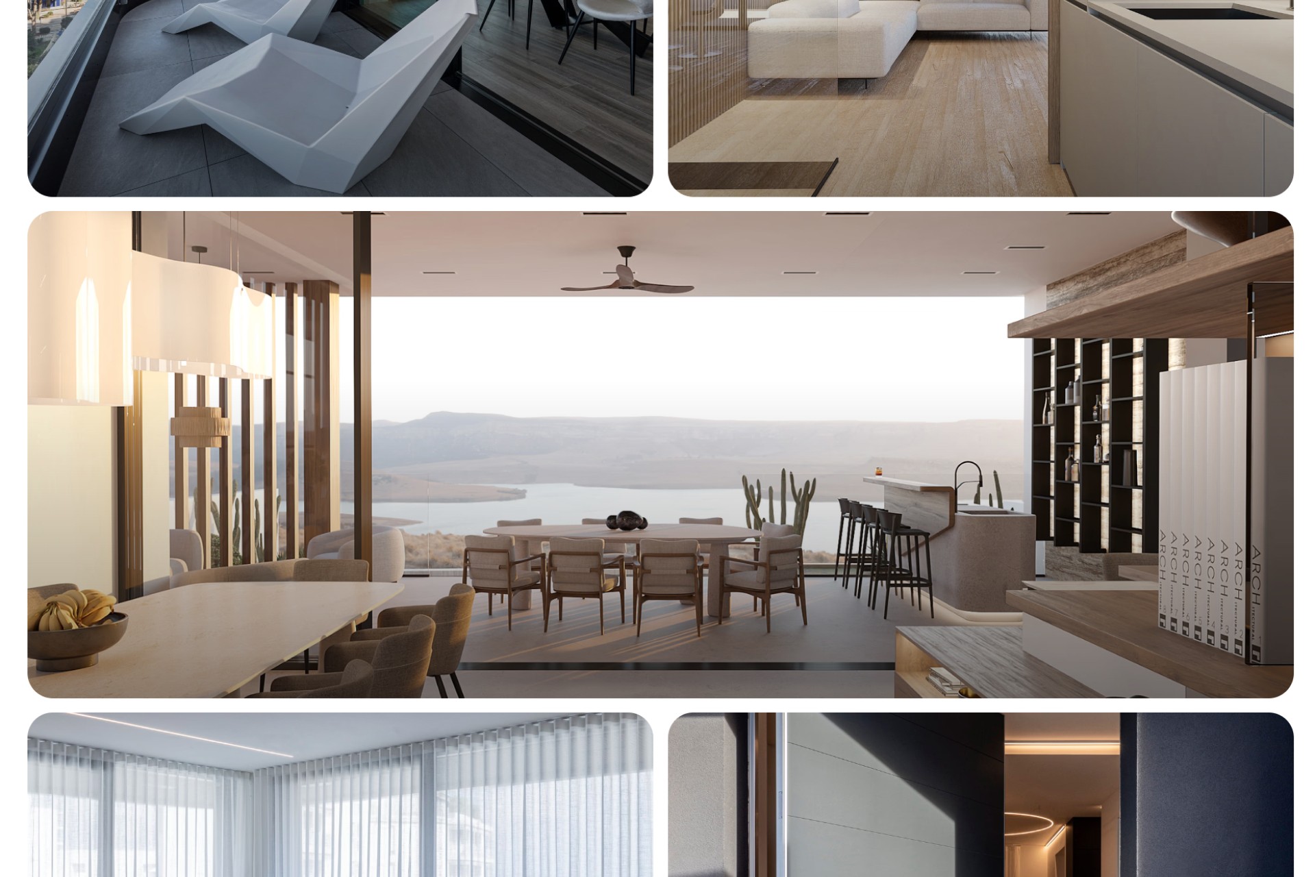
LET THE PROJECTS SPEAK.
Large imagery takes the centre of the page, so each space is seen before it is explained. The interface steps back and lets the work make the case.
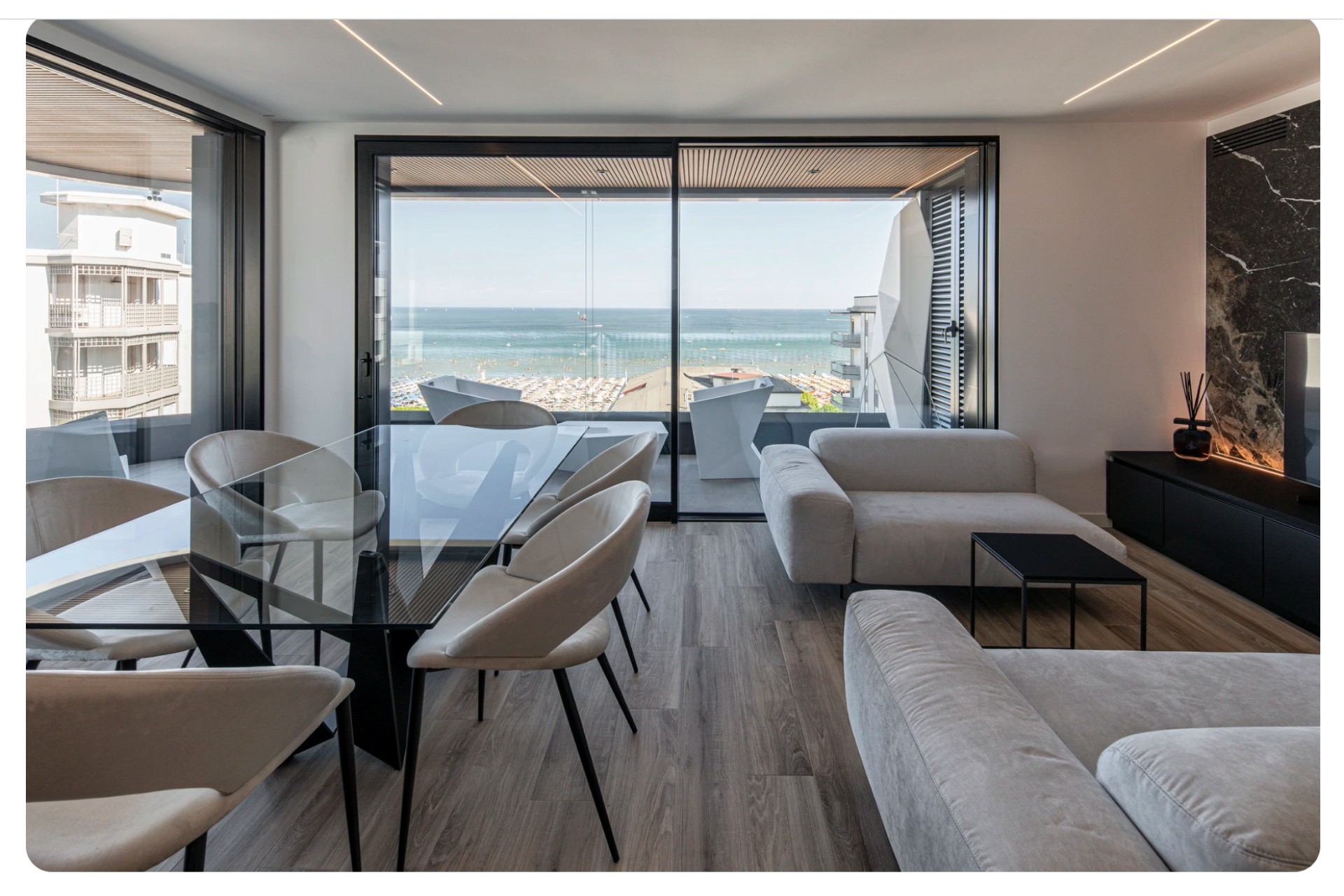
ATTENTION ON THE WORK.
Clear typography and intuitive navigation keep the interface quiet. Visitors move between types of space without thinking about how.
AN EDITORIAL PACE.
Browsing follows a smooth, editorial rhythm, with subtle animations and microinteractions marking each step. The visit feels guided rather than scrolled through.
KEY DECISIONS.
I kept the portfolio itself at the centre of the experience. My approach to the build was to give each project room to make its own case, with the interface supporting the work rather than competing with it.